Finding product/market fit for restaurant revenue management software.
I led product design at Copilot as we strove to find product/market fit. Our proprietary ability to process and distribute data from leading Point of Sale systems gave Copilot the unique ability to provide enterprise-level business insight to independent restaurants.
We dramatically simplified the delivery of actionable insights, focusing on timely push content rather than a power dashboard.
After several iterations, 80% of our customers engaged with Copilot insights every day.
Discovery & analysis
User research
Focus on an approach
Define the product
Prioritize features
Wireframe IA & UX
Simplify visuals
Learn from failure
Redesign to fit existing workflows
Simplify more for mobile
Establish habit
Results
80% daily engagement
74% consider it essential
My involvement
As Copilot's only designer, I did many things, including product marketing, front-end development, and product analysis. Within the scope of this case study I handled:
- User research
- Workflow & product definition
- Wireframing
- Visual design
- Front-end development
Audience
Copilot’s target user is the decision-maker - typically the owner or general manager - at an independent restaurant or small restaurant group.
Restaurant decision-makers want to put as many “butts in seats” as possible while maintaining smooth operations, high staff morale, and delivering great hospitality.
They juggle many areas of concern. They’re distracted, often focused on the problem that’s most pressing right now. There’s little time left to carefully consider decisions affecting the bottom line of their business.
Customer insights
I spoke with dozens of restaurant owners and general managers to learn how they think about their business, how they spend their day, and what keeps them up at night.
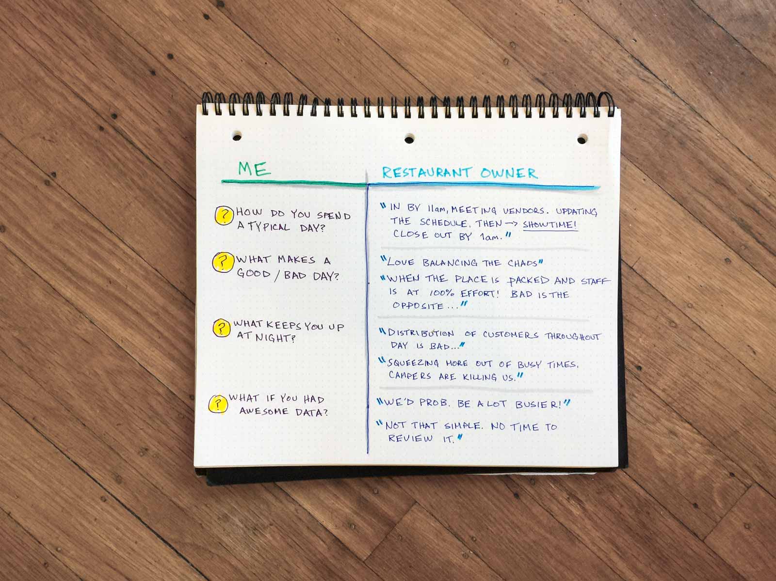
Takeaways
- Restaurant owners want to put more effort into analyzing business performance data, but aren't able due to distractions and time constraints. It’s like going to the gym - despite good intentions, it's rare.
- When users do engage with data, they don't want to dig into the details. They need simple, actionable answers.
- Also, they’re skeptical of data that conflicts with their instincts (which is often the case). Copilot must generate trust without overbearing detail.
Focusing on an approach
Copilot existed to facilitate quality decision-making for high-impact activities that our users were neglecting.
Together, these activities constitute Revenue Management — the application of disciplined analytics to predict consumer behaviour at the micro-market level and optimize business levers to maximize revenue growth.
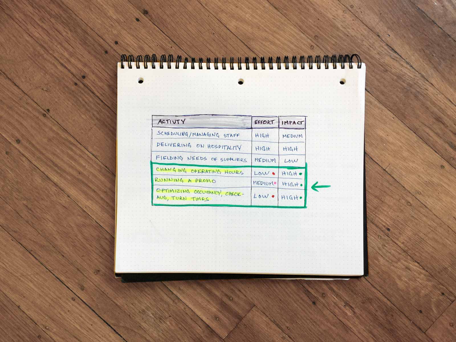
Prioritizing functionality
Beta users helped prioritize features via card sorting — a research activity in which users categorize features and make tough prioritization decisions.
Product design
Wireframing IA & UX
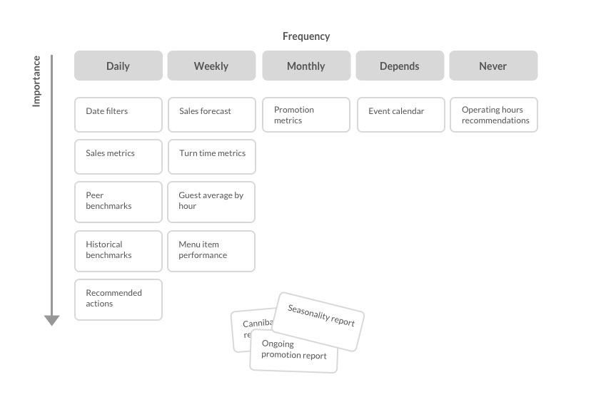
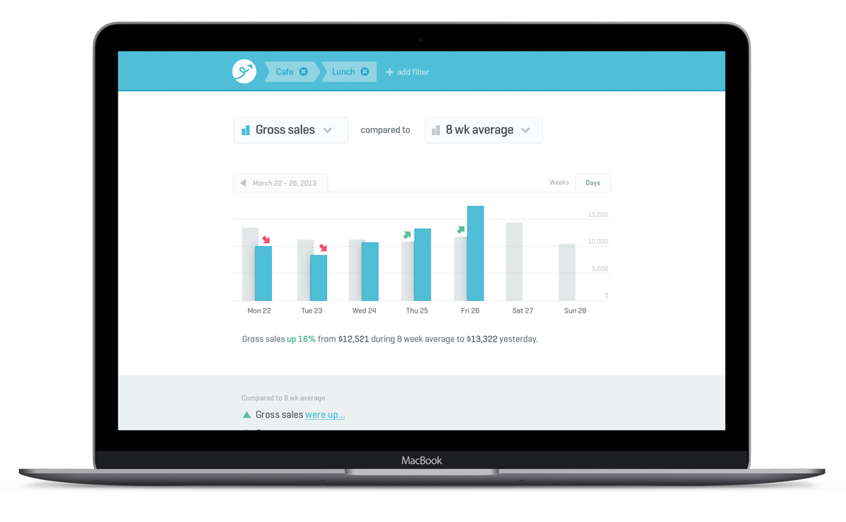
In the rare cases users engaged with data, they did so on the big screen — the POS. Card sorting revealed keen interest in powerful data analysis features such as forecasting, benchmarks, and filtering.
Power functionality desired the space and form-factor of the web, so I started there.
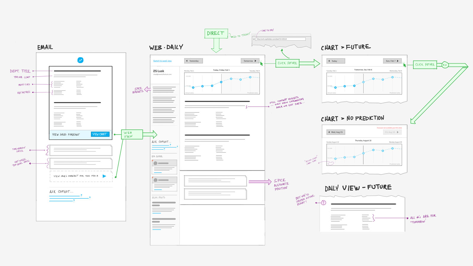
While testing the wireframes, users were confused by how forecasts were calculated. They were more comfortable using historical benchmarks for forecasting.
Product design
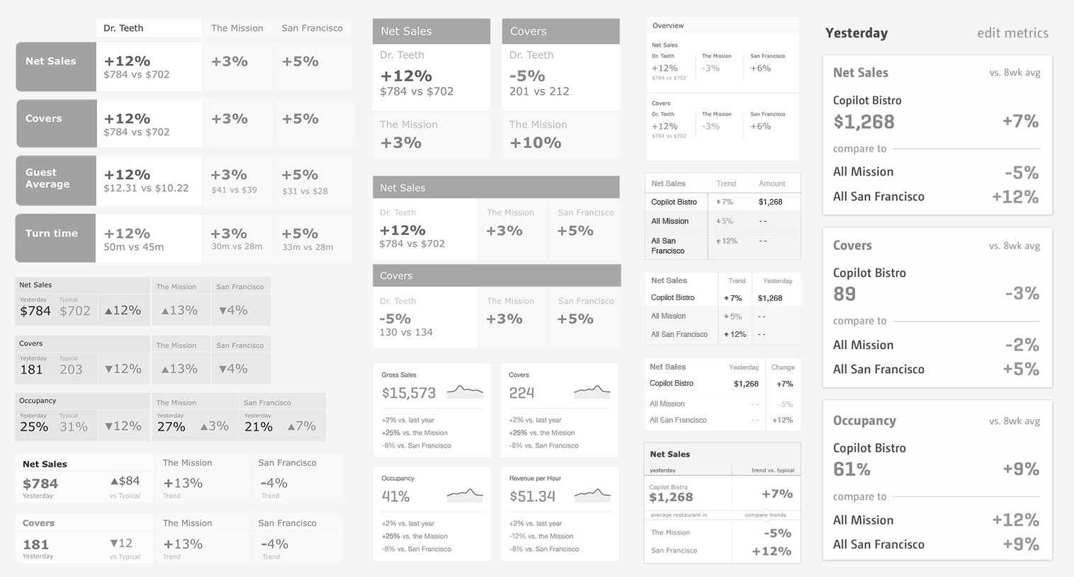
Simplifying the UX
During visual design I simplified the layout and evolved the forecast model into a flexible benchmark model. Benchmarks were more familiar to users and retained most of the value of a forecast.
Product design
Launch & failure
Once launched, not a single user logged in. We designed and built Copilot's web product hand-in-hand with a loyal, enthusiastic base of beta customers. And yet, none of them actually wanted to use what their feedback had helped shape.
But the problem wasn't the feature set. It was the delivery mechanism.
Recall that our target users have neither the time nor the impulse to log into a web app. They're not even in front of a computer for much of the day. Copilot needed to fit seamlessly into their existing workflow.
Redesign
Fitting seamlessly into existing workflows
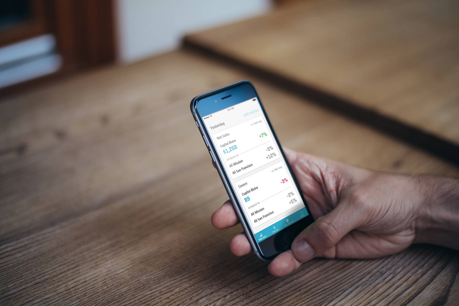
The best way to get embedded in our users' chaotic workflows was by being in their pockets. The redesign would be mobile-first.
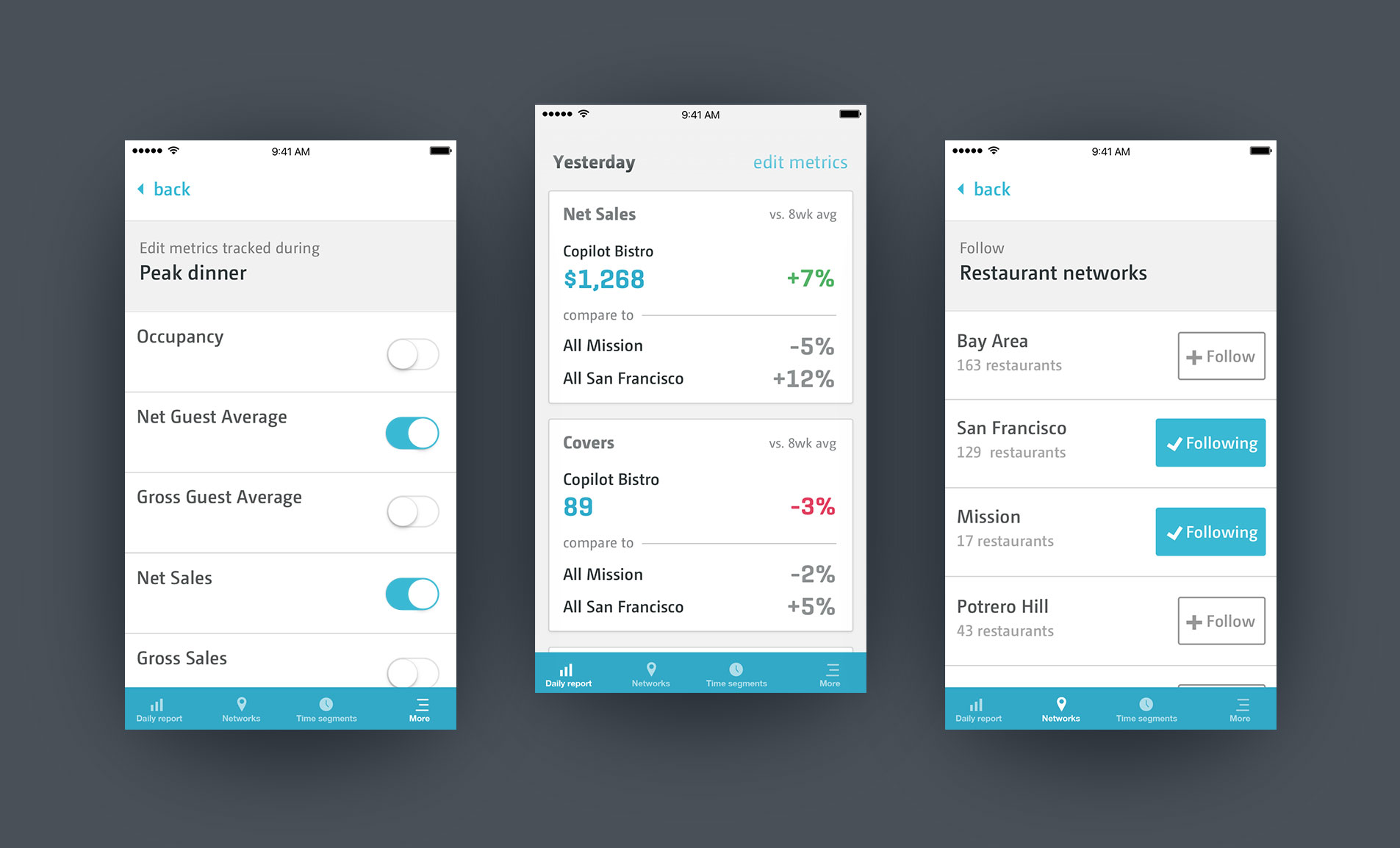
We wanted Copilot to become an essential habit - akin to the morning cup of coffee or pre-shift staff meeting. To establish this habit, Copilot needed to:
- Notify users that a fresh Copilot Daily Report was ready
- Be easily accessible in our users' chaotic environments
I needed to simplify further.
In parallel, I continued to discover the compelling power of benchmarking. Comparing current performance to the past was interesting, but it was even more interesting to compare the daily performance of a single location to that of a group of its peers.
Another key change the focus on push notifications. At 10am sharp, Copilot would notify users that their daily report was ready to review.
Results
Engagement skyrocketed
This time, the form factor and focus on notifications worked. Within a month, 80% of users were engaging with the daily report every day.
Peer group benchmarks proved especially compelling. Customers now considered Copilot an essential part of running their business.
More Case Studies
Let's chat.